
Depths Of Philanthropic Visualizers
A lot of times, treasure is found just stored somewhere amongst the midst of websites of graphic designers who aren't shouting for your attention or the riding the waves of capitalism. Tourist Magazine was just a stumble-upon I had one weekend, while predominantly occupied in clicking link after link, site after site, via tumblr. Check out the articles, some of these aesthetically mesmerizing, visually entailing photos+videos take you to places even deeper in the ever-growing cyber universe of art and design. Labels: Publication, site


Magazine Library
Labels: Event, Magazine, Publication
I suddenly wished I was Hiro Nakamura though my favourite character has always been Sylar but anyway that's not really the point. If I was Hiro, not only can I travel through space to the Magazine Library, I would be a born Japanese. Check out the coolest library ever if you happen to be somewhere near this OMOTESANDO HILLS or if you can teleport that is.
Apartamento
Labels: Magazine, Publication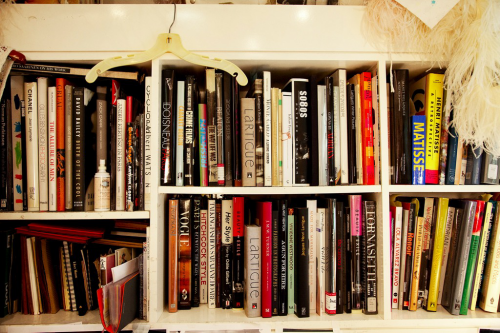
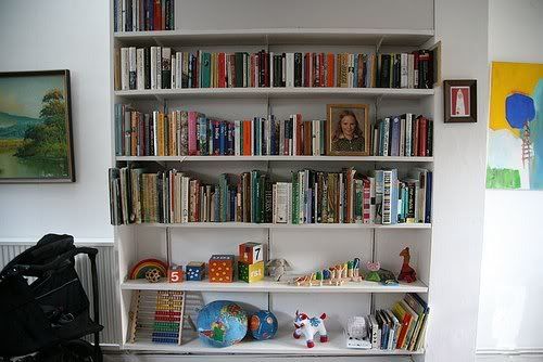
(I would love to credit these but i dont remember where i got them, please let me know if they belong to you)
I was always intrigued by how book spines can stand against one another in the most mismatching manner to create really attractive "wallpapers" within a certain space. Tiny snippets of a person's character sneaks out within few words expressed with a typeface or some colours. They remind me of little windows into somebody's soul. We can tell an entire section in a library by merely glancing across book spines.
The story goes like this: a designer creates the personality of a publication, the reader buys it and it becomes some sort of a representation of his own identity. The reader's entire collection of books then come together to tell an untitled story. Whether he is a romantic at heart or a sci-fi geek- this is one of those rare moments when self-expression appears effortless. It is not so much about the shelves but what you put on it.
"Books, magazines, newspapers and other forms of printed matter often become part of a space and truly represent the personality of the individual or group that inhabits it." - Markus Miessen
He said it within a sentence. Why do i bother typing? Read the article in Apartamento magazine. Speaking of which, i have failed one too many times to put down the new issue.
Kasino A4
Labels: Publication
photo stolen from Kasino A4
Dragging my cheapo ass along, i visited my favourite section in Borders today to kill some time. Kasino A4 was heartwarming like tea on a cold day. Issue #7 extends its branches to draw and welcome you into the family. As a magazine junkie, i enjoy every word that's well-written and thought out by editors in the one and only space they get to proclaim their say directly in every issue. However, look hard for the editor's note and you will find none in this issue. Instead, enter the world of the art director with his mother's love and words. Butt naked baby photos printed on non-coated, 50gsm, this issue smells like mum's cooking.
Fantastic Man
Labels: Publication
Clip/Stamp/Fold
Labels: Architecture, Magazine, Publication

You have the publication, a magazine.
Architecture keeps us all at the edge of our seats.
Combine those and then throw in the great history. The revolution from "little magazines" about your favourite cityscape to the Domus you read today at 15 bucks.
Don't say i didn't caution, this is a timeline that would leave you begging for more.
http://www.clipstampfold.com/
Not so, current affair
What happens one day if someone took news and made them aesthetically pleasing? Wouldn't that be good since it would make like a 100 more people want to read it better? Labels: graphic design, Publication, site
That is completely impossible. And we all know that it is due to the timespan given to churn out tomorrow's papers. Copyrighters, editors and etc cannot afford to wait for designers to get anal about space and form. The appeal of the newspapers goes as far as its functions - its layout for legibility, illustrations and photography for clear cut communication of the event to its most accurate level. There is no time to source for abstract pieces and fuss about expressive typography in the world where today's news becomes tomorrow's trash, tomorrow's news enters our lives.
Sure, one can argue that there are insane designers out there who are able design faster than you can say newspapers. Another reason would be due to a sense of awareness and passiveness towards the current event that newspapers are not over-designed or designed at all. Picture this, an article on the Tsunami or 9/11 flooded with in your face typography. The papers would eventually end up seeming superficial and unreliable. These are people who's lives are dramatically changed and there you are, um, beautifying the layout about their missing family members? This is one such case where typography is a tool and not meaning itself. The type assist the content, not enhance it. Even though we design for a living (soon), we should always be purpose driven.
That said, despite having reasoned it all out, i still find myself incapable of picking up that pile of grey delivered straight to my doorstep daily, let alone read it. I just cant be bothered and that is something no amount of graphic design can change.
However, the same cannot be said for Newwork Magazine. Even if its for 40gsm paper printed in black and white, even if its 13.99USD. Customized typefaces, large format extremely light-weighted papers that you can glue to your wall.
Yes news papers can be flexible like that.


